Sydbank
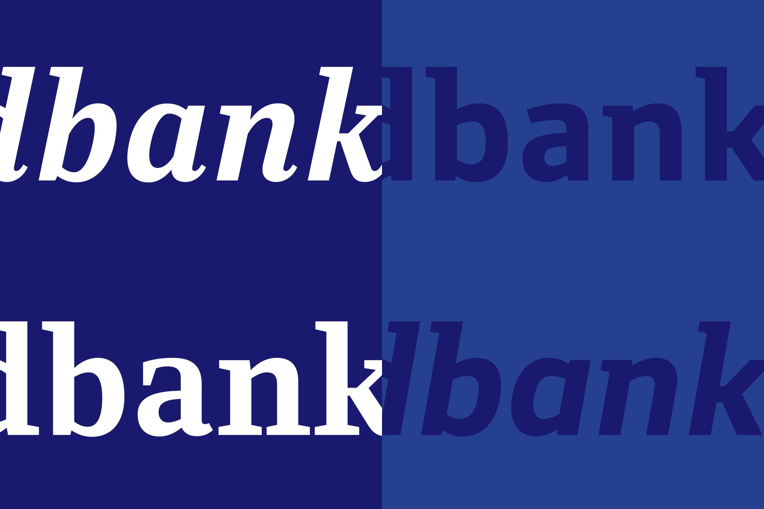
Sydbank Serif is an accompanying typeface to the already existing Sydbank Sans.
A mash up of Scandinavian design and transitional type in terms of contrast, construction and true italic. Sydbank Serif is a beautiful, curvy member of the minimalistic and very constructed Sydbank type family

»Sydbank Serif is designed to match the existing Sydbank Sans. It is a transitional typeface with a curvy italic, though based on this very constructed Sans (semi) Serif«

»Sydbank Serif is designed and optimised to work as a text typeface, meeting all the requirements for smaller sizes, running text & how the italics complement the regulars«

»The span of weights makes it useful for all typographic elements, text & headlines, small & big sizes of text«


»Sydbank Serif italic is designed specific for headlines & quotes in the dark sizes, as well as a well working companion for the regular in the reading friendly weights. They work together, but also independently«

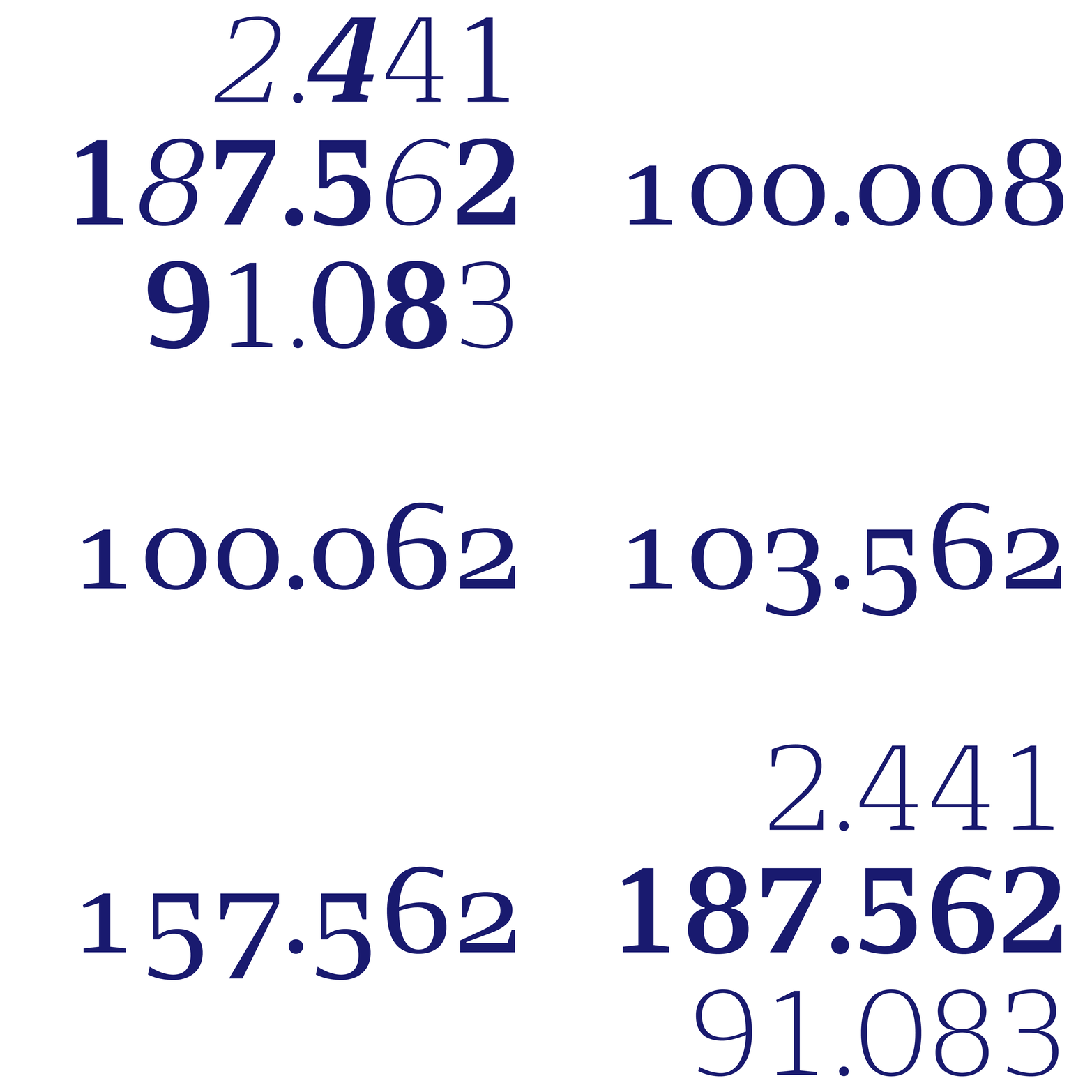
»Numbers are important to a bank. Numbers in text, columns of numbers for accounting, fractions, phone numbers, dates, numbers in different weights that both differs & match«


Typeface: Sydbank Serif
Client: Sydbank
Agency: Loop Associates
Design date: 2021
Contact: Trine Rask
