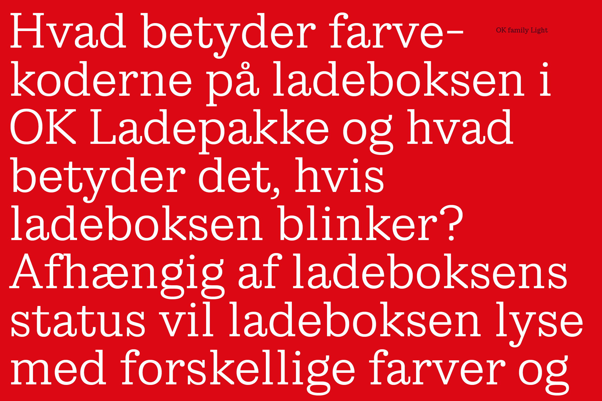
OK family

»OK family is part of an updated visual identity & related to the updated logotype. A sharp, contemporary Clarendon with a characteristic K to influence all text with the logo identity«


»Five variants, no italic. OK family is designed as a display typeface to be combined with a sans serif text typeface. With few specific needs of specific glyphs, it is a straight forward typeface charming & sharp that does the job«


»Big sizes of text, but not necessary big amounts of text gives the possibility of nice details & small parts and inner spaces, that might not make to a hard core, legible text typeface. Knowing the context and use of a typeface is always the key to succeed«

Typeface: OK family
Client: OK a.m.b.a.
Agency: Bold Scandinavia
Design date: 2024
Contact: Trine Rask
