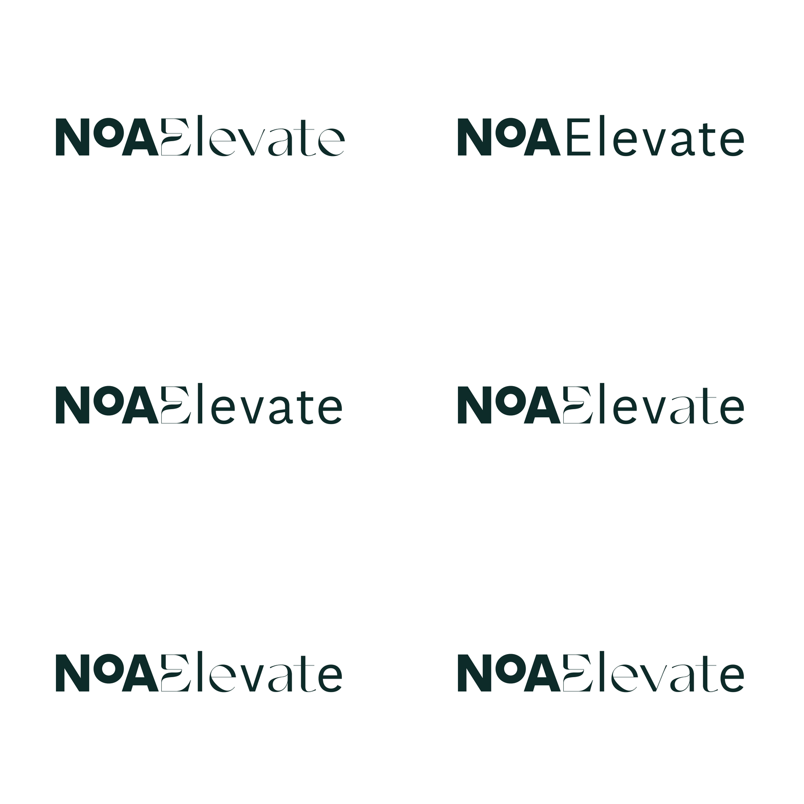
NoAElevate

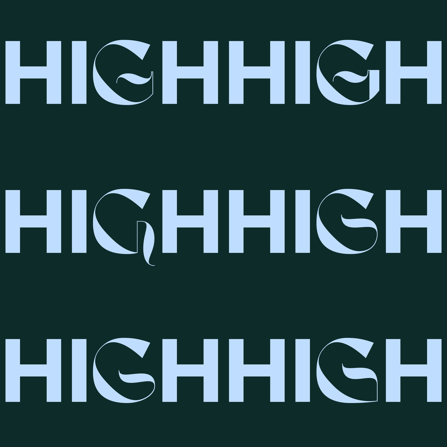
»The big difference between lettering and type design is the context. In lettering you know exactly what will be next to the letter you are drawing or you know that the letter will stand alone. For Noa Elevate we knew that the letters will be mixed with NoA Aften Screen by Monokrom Skriftforlag«

»Contrast. Contrast to the context, contrast between the letters instead of harmony. Some letters are just more beautiful and more interesting to work with than others. Curves, diagonals, joins, some letters are more flexible in their basic shape and some are more well defined«


»In use the letters must be very strong and different to catch the viewers eye, since the letter might be surrounded by many other elements on ex. a website. Different from context & different from expectations«

In collaboration with Richard Feldeus
Client: NoA Elevate
Agency: Bold Scandinavia
Design date: 2023
Contact: Trine Rask
